library(hellodatascience)
library(tidyverse)Accessible Data Visualizations
Saving a Plot
base_bar_plot <-
  ggplot(
    data = atus_college,
    aes(
      x = employment,
      fill = enrollment
    )
  ) +
  geom_bar(position = "dodge")

base_bar_plot 
Labels
improved_bar_plot <-
  base_bar_plot +
  labs(
    title = "Student Count by Employment and Enrollment Status",
    subtitle = "Most students work part-time while enrolled full-time",
    x = "Employment Status",
    y = "Number of Students",
    fill = "Course Enrollment",
    caption = "Data source: American Time Use Survey 2024 (n = 312 students)"
  )

improved_bar_plot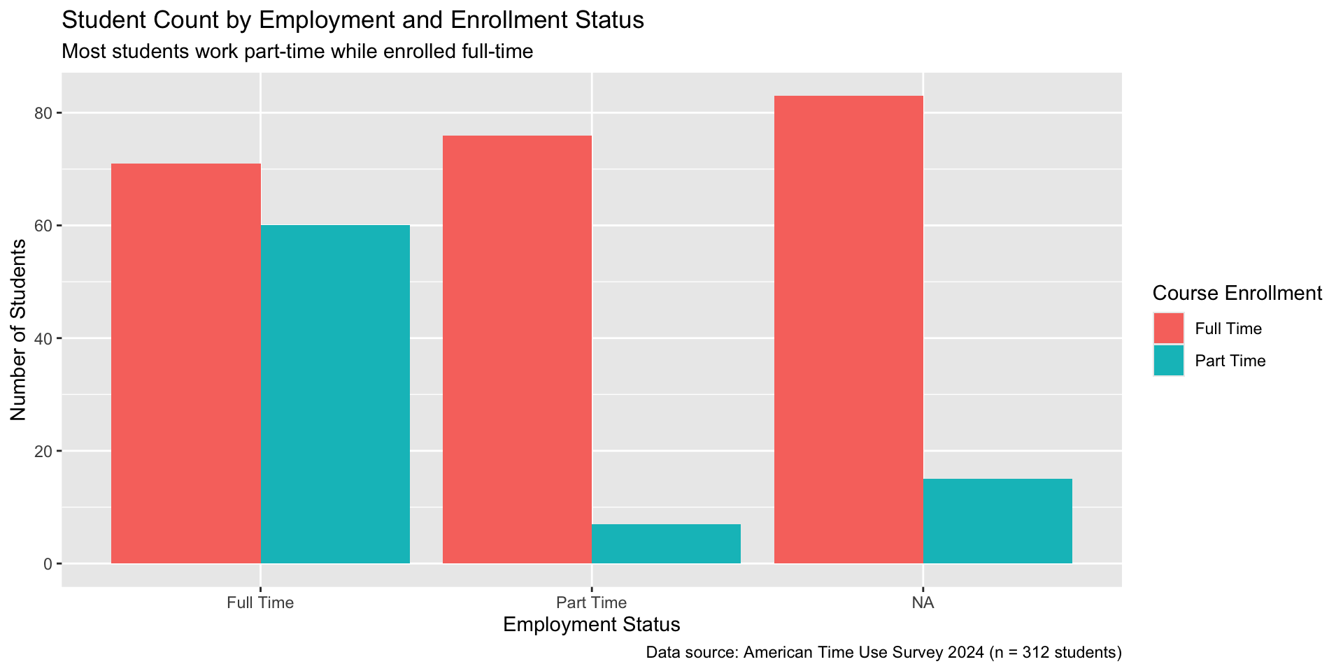
Themes
improved_bar_plot <-
  improved_bar_plot +
  theme_minimal()

improved_bar_plot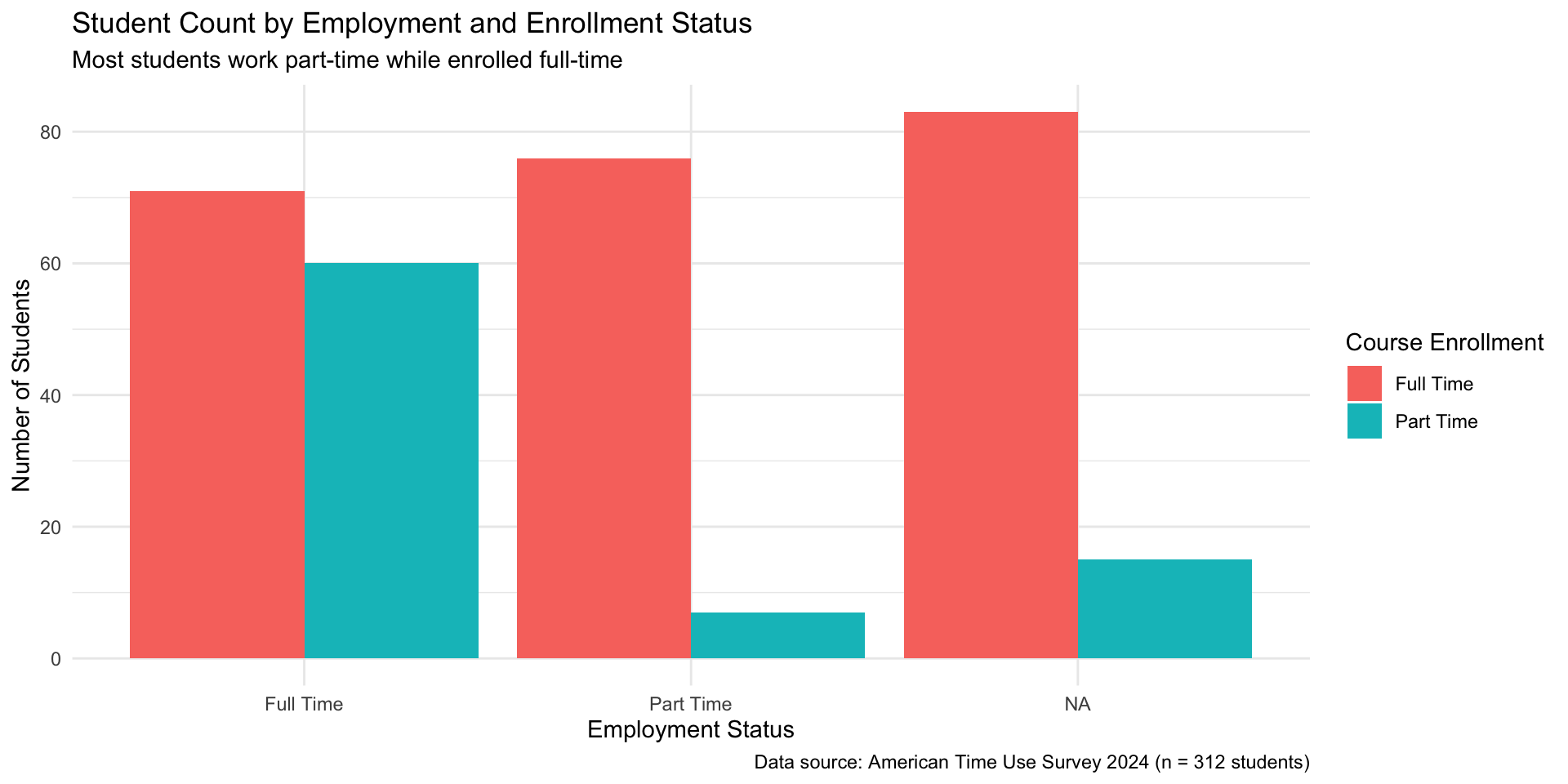
theme_minimal
Other themes include but not limited to: theme_bw(), theme_light(), theme_dark(), theme_classic().
Using theme() function
improved_bar_plot <-
  improved_bar_plot +
  theme(
    plot.title = element_text(size = 18),
    plot.subtitle = element_text(size = 14),
    axis.title = element_text(size = 12),
    axis.text = element_text(size = 10),
    legend.title = element_text(size = 11),
    legend.text = element_text(size = 9),
    plot.caption = element_text(size = 8)
  ) +
  labs(title = "Student Count by Employment and \n Enrollment Status")

improved_bar_plot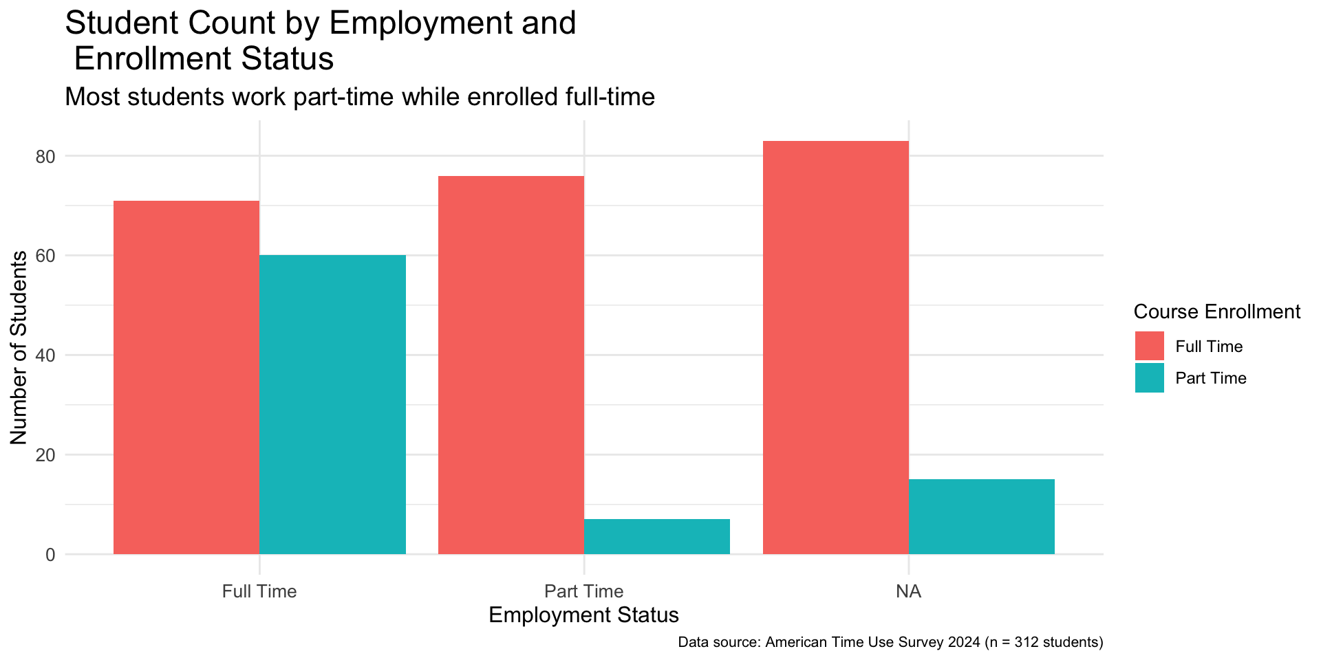
Changing legend location
improved_bar_plot <-
  improved_bar_plot +
  theme(legend.position = "bottom")

improved_bar_plot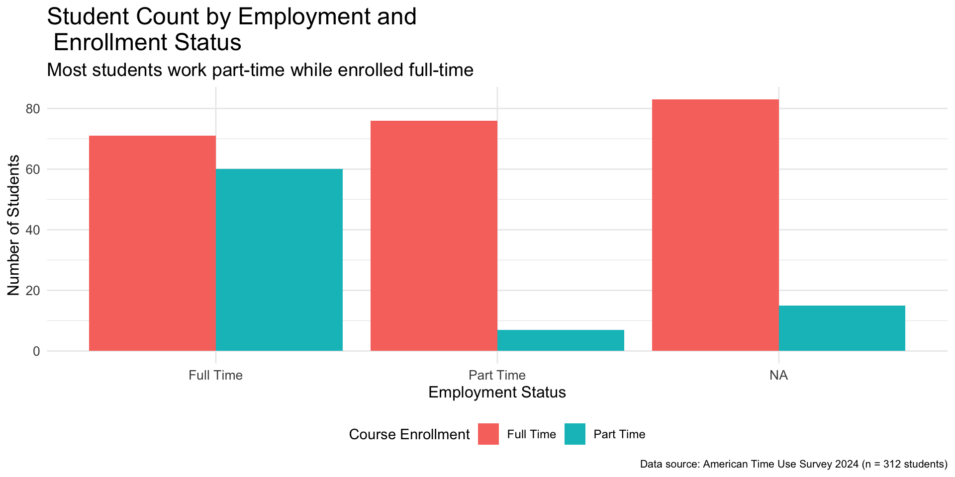
Colors
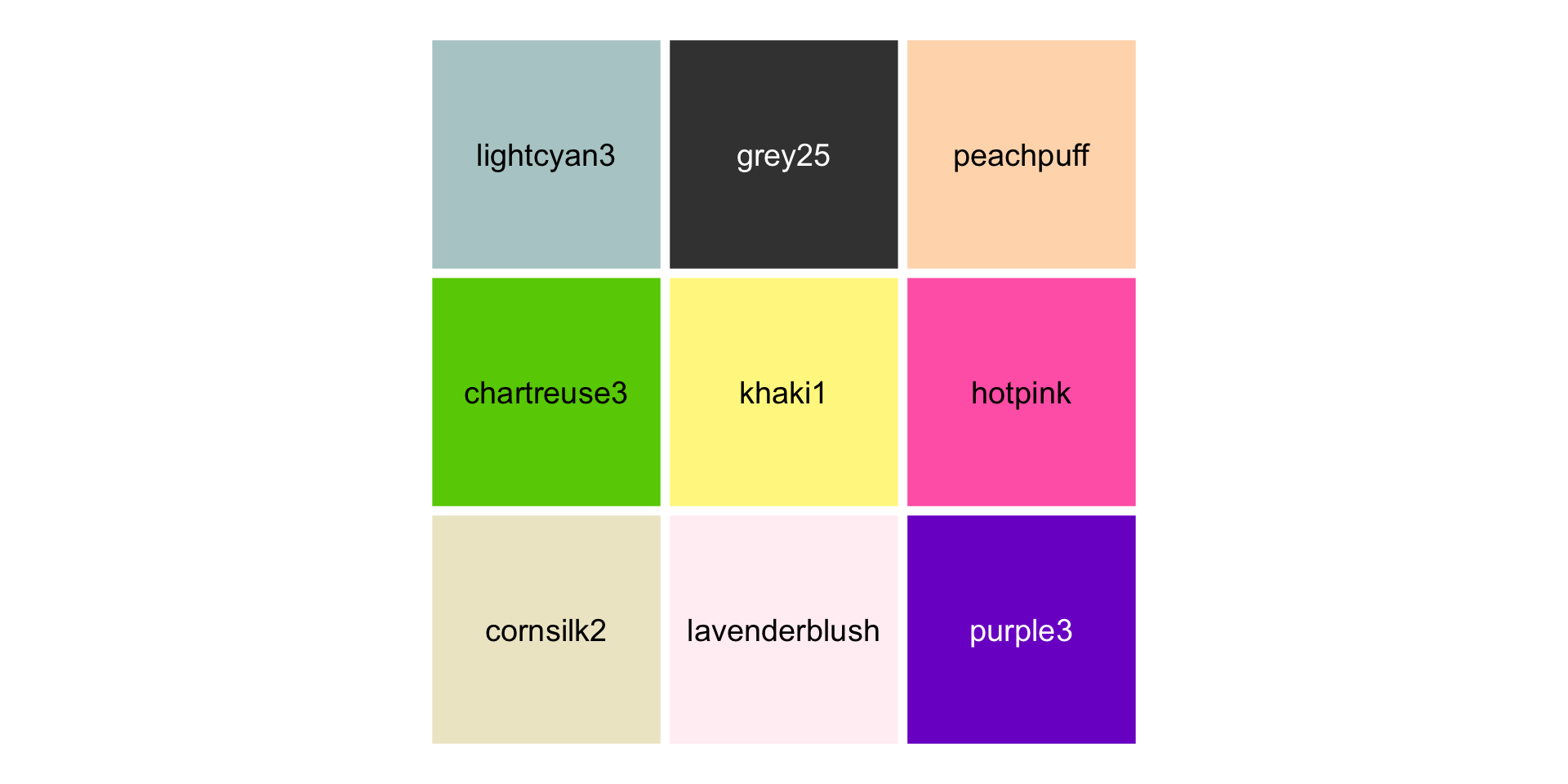
Figure 6: Nine colors randomly selected from R colors as listed by the colors() function
Hex Codes

Figure 7: Hex codes for the randomly selected nine colors
Okabe-Ito Color Palette
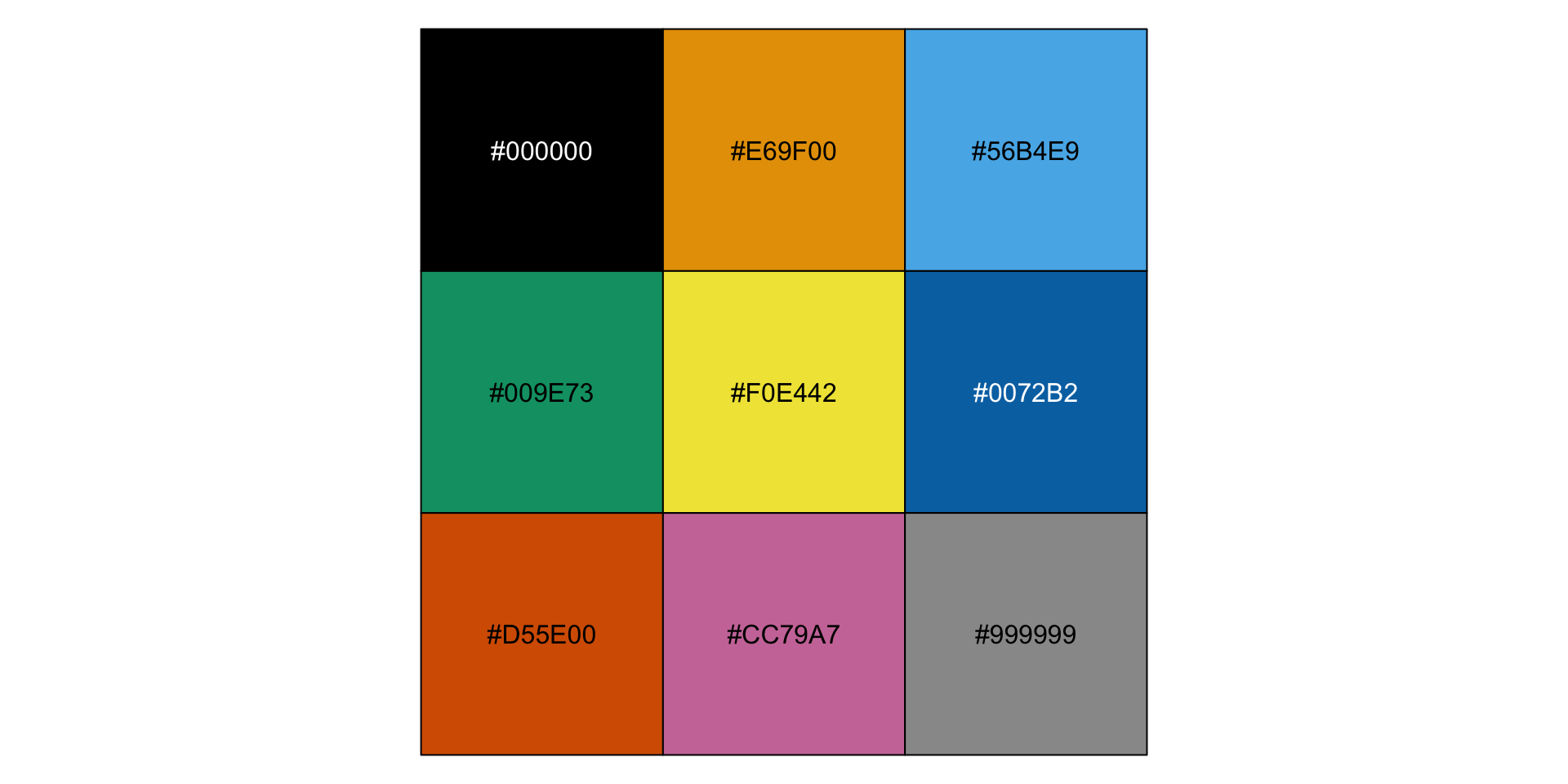
Figure 8: Hex codes of colors in the Okabe-Ito palette
Changing Colors
improved_bar_plot <-
  improved_bar_plot +
  scale_fill_manual(
    values = c(
      "Full Time" = "#009E73",
      "Part Time" = "#CC79A7"
    )
  )

improved_bar_plot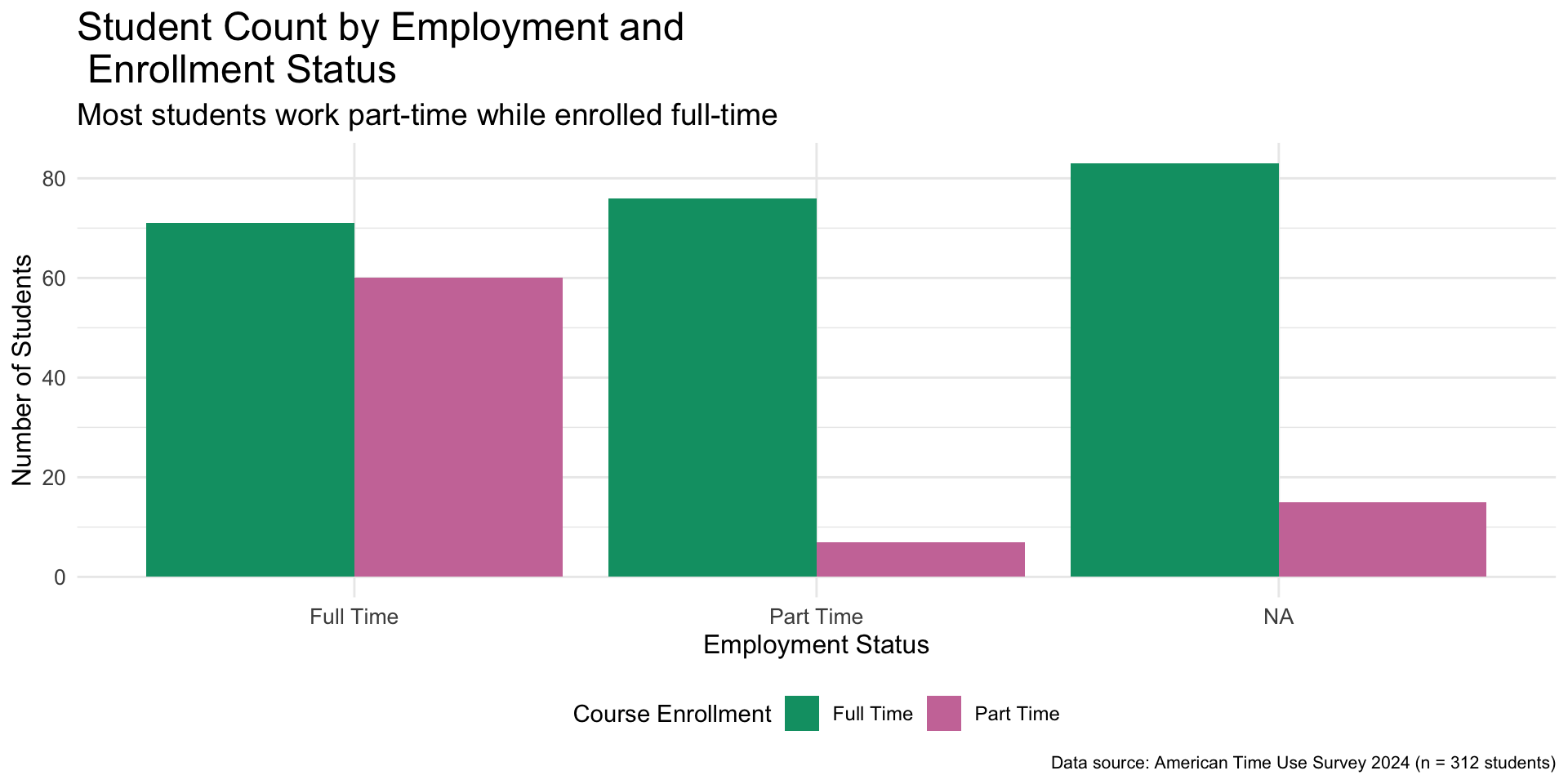
Look at how far we have come - Default plot
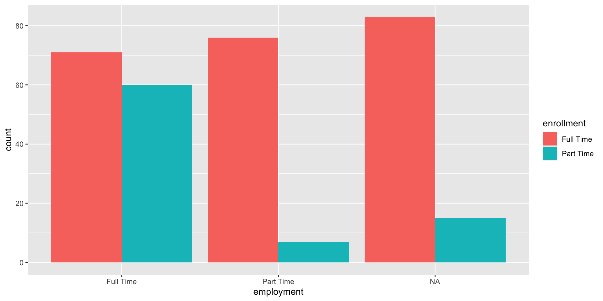
Figure 10: Default Bar Plot
Look at how far we have come - Improved plot

Figure 11: Improved Bar plot
Customizing Scatterplots
simple_scatterplot <-
  ggplot(
    data = atus_college,
    aes(
      x = time_alone,
      y = weekly_earnings
    )
  ) +
  geom_point() +
  labs(
    x = "Time Alone (minutes)",
    y = "Weekly Earnings ($)"
  ) +
  theme_bw()

simple_scatterplot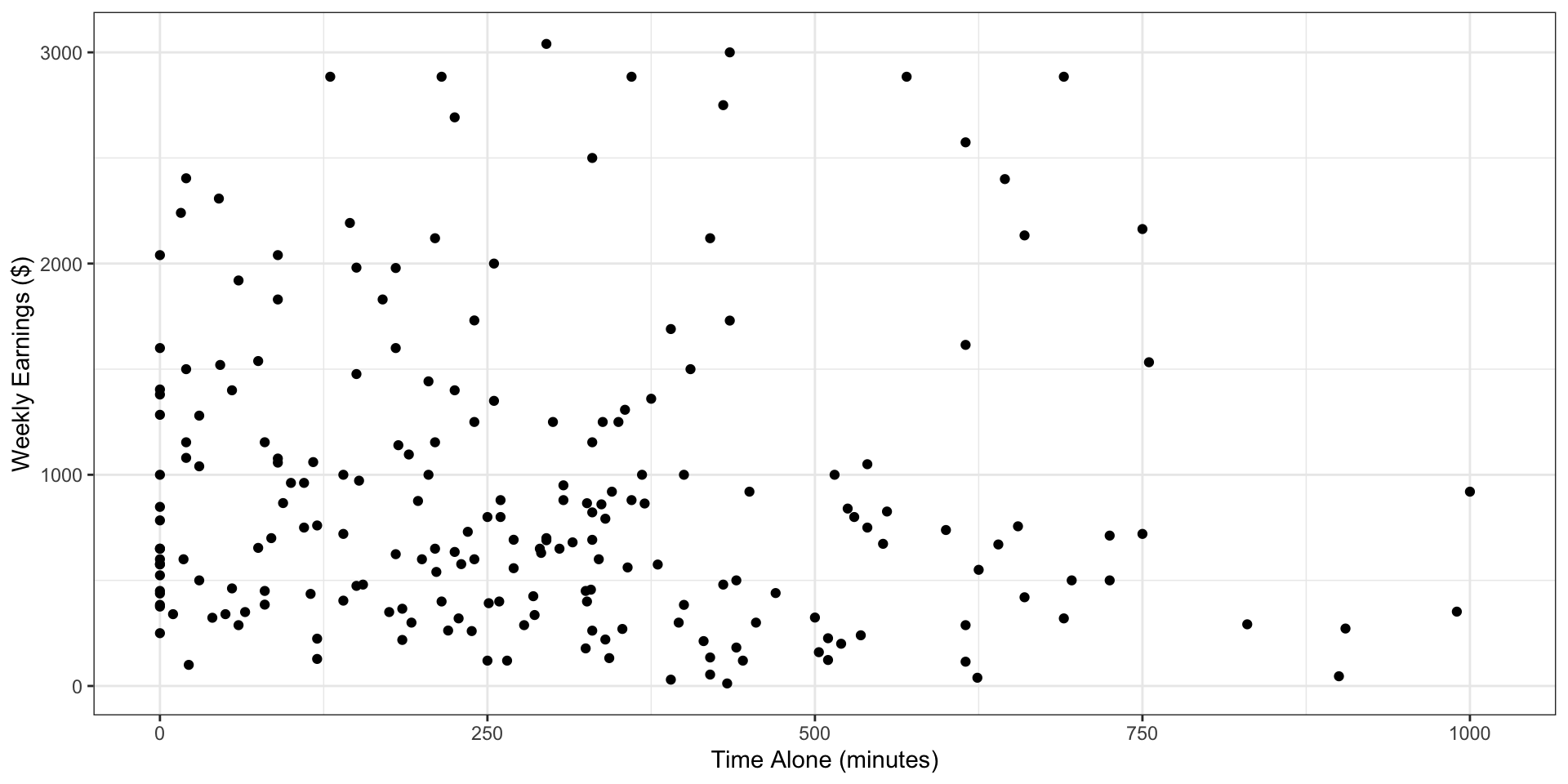
Customizing Scatterplots
colored_scatterplot <-
  simple_scatterplot +
  geom_point(
    color = "aquamarine4",
    size = 4,
    shape = "square"
  )

colored_scatterplot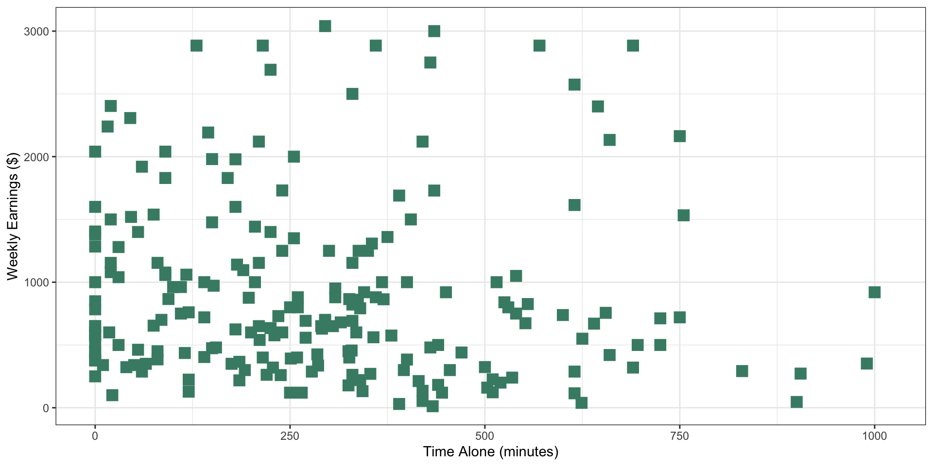
Facets
simple_scatterplot +
  facet_grid(rows = vars(employment), cols = vars(enrollment))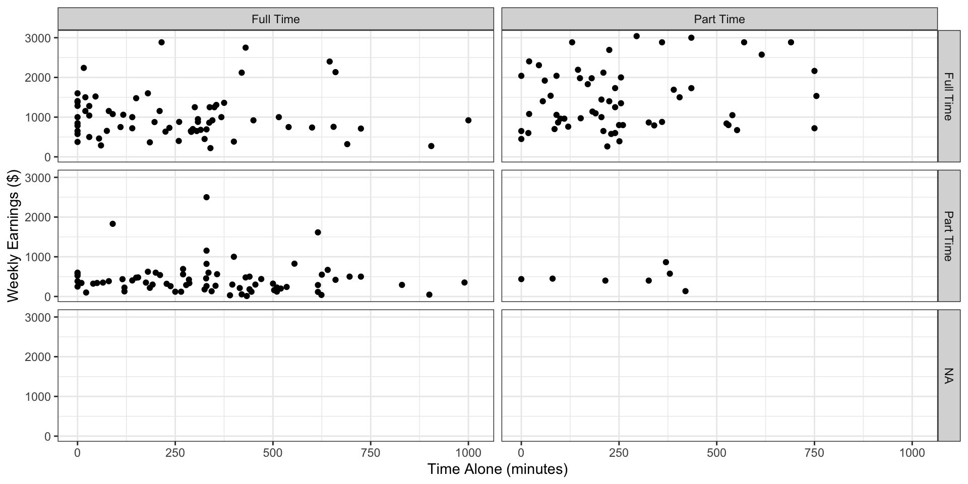
Figure 14: Time spent alone versus weekly earnings broken by employment and enrollment status using facets
Facets - Rows only
simple_scatterplot +
  facet_grid(rows = vars(employment))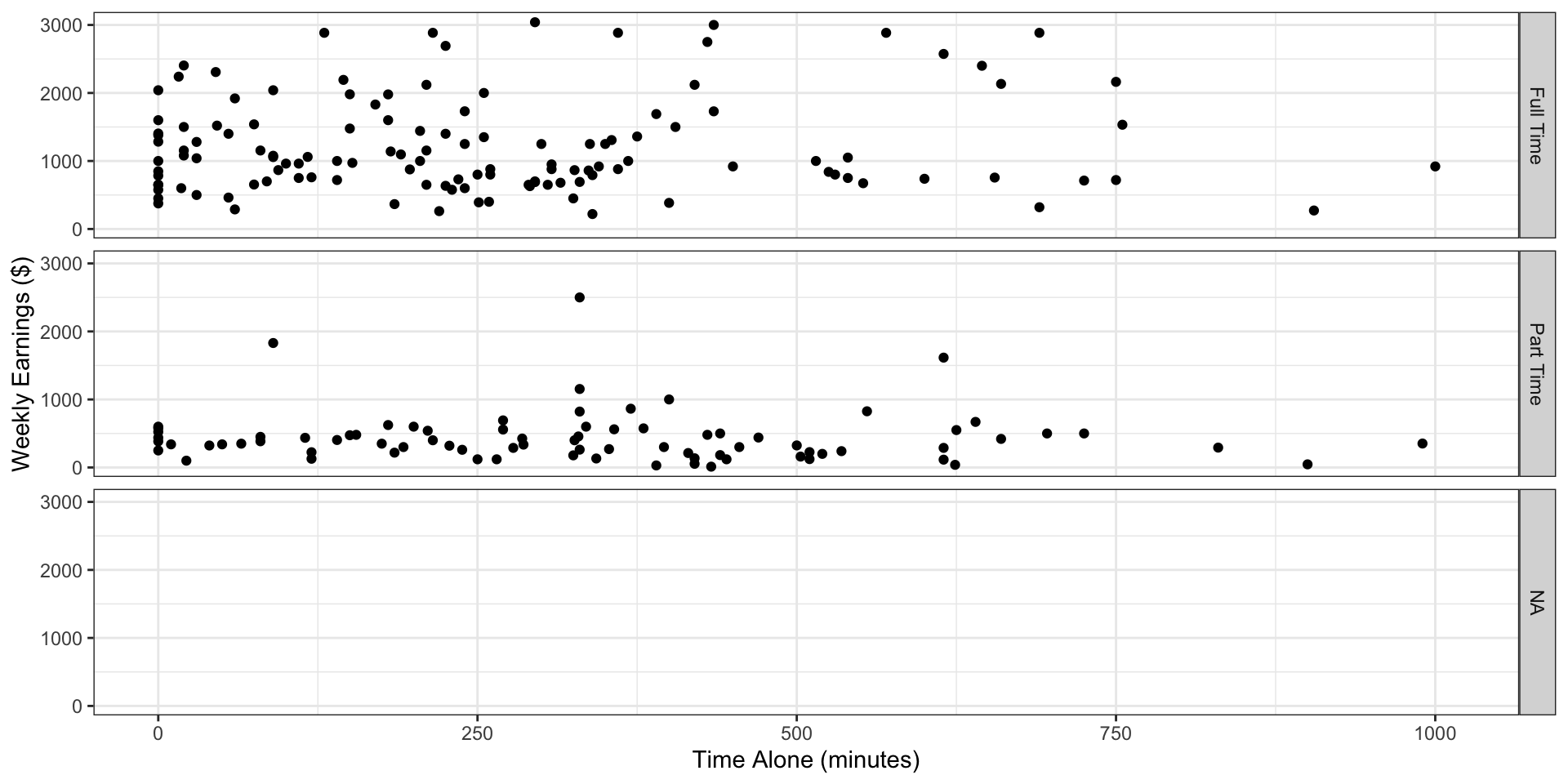
Figure 15: Time spent alone versus weekly earnings broken by employment status
Alt text in ggplot
improved_bar_plot +
  labs(
    alt = "Barplot showing student count by employment and enrollment status. The y-axis shows number of students from 0 to 80, and the x-axis shows employment status (Full Time, Part Time, NA). Each employment status is broken down by full time or part time enrollment status. The plot displays six bars: students enrolled full time with full time employment (approximately 70 students), part time employment (apprximately 75 students), and unknown employment (approximately 80 students) as well as students enrolled part time with full time employment (approxmately 60 students), part time employment (approximately 18 students), and unknown employment (approximately 15 students). Data source: American Time Use Survey 2024 (n = 312 students)."
  )
Figure 16: Bar plot of employment broken down by enrollment status with added alternative text in the background
Saving Simple Plot
x <- 1:10
y <- 1:10

simple_plot <-
  ggplot(
    data = data.frame(x = x, y = y),
    aes(x = x,  y = y)) +
  geom_point()

simple_plot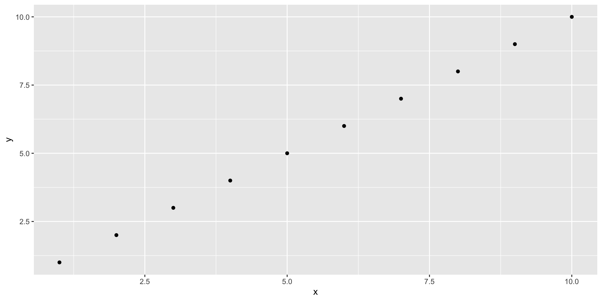
sonify() function works