Rows: 1,236
Columns: 8
$ case      <int> 1, 2, 3, 4, 5, 6, 7, 8, 9, 10, 11, 12, 13, 14, 15, 16, 17, 1…
$ bwt       <int> 120, 113, 128, 123, 108, 136, 138, 132, 120, 143, 140, 144, …
$ gestation <int> 284, 282, 279, NA, 282, 286, 244, 245, 289, 299, 351, 282, 2…
$ parity    <int> 0, 0, 0, 0, 0, 0, 0, 0, 0, 0, 0, 0, 0, 0, 0, 0, 0, 0, 0, 0, …
$ age       <int> 27, 33, 28, 36, 23, 25, 33, 23, 25, 30, 27, 32, 23, 36, 30, …
$ height    <int> 62, 64, 64, 69, 67, 62, 62, 65, 62, 66, 68, 64, 63, 61, 63, …
$ weight    <int> 100, 135, 115, 190, 125, 93, 178, 140, 125, 136, 120, 124, 1…
$ smoke <int> 0, 0, 1, 0, 1, 0, 0, 0, 0, 1, 0, 1, 1, 1, 0, 0, 1, 1, 0, 1, …Simple Linear Regression
Baby Weights
ggplot(babies,
       aes(x = gestation, y = bwt)) +
  geom_point()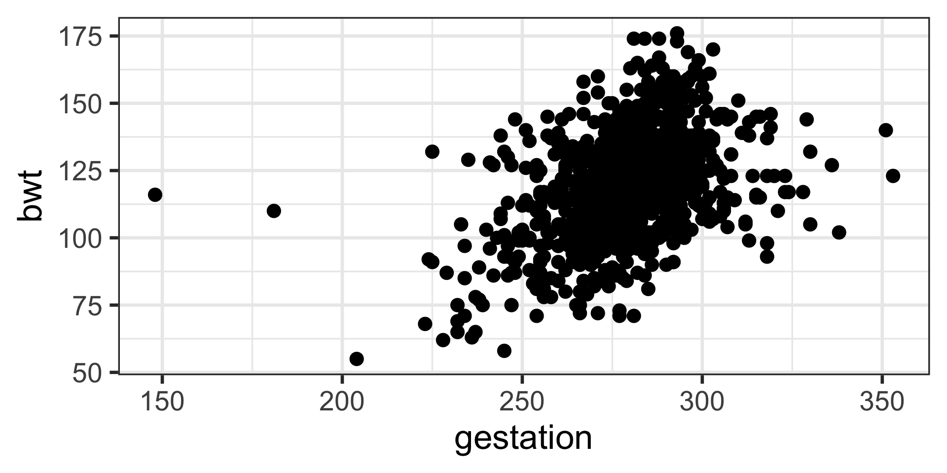
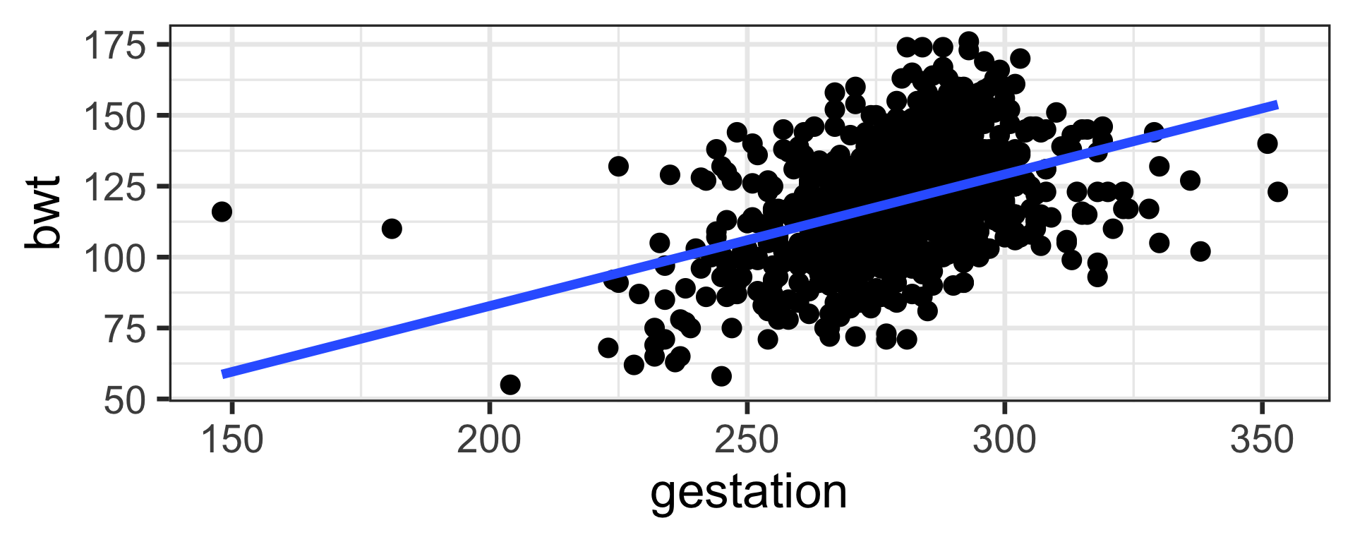
Baby Weights
ggplot(babies,
       aes(x = gestation, y = bwt)) +
  geom_point() +
geom_smooth(method = "lm", se = FALSE) 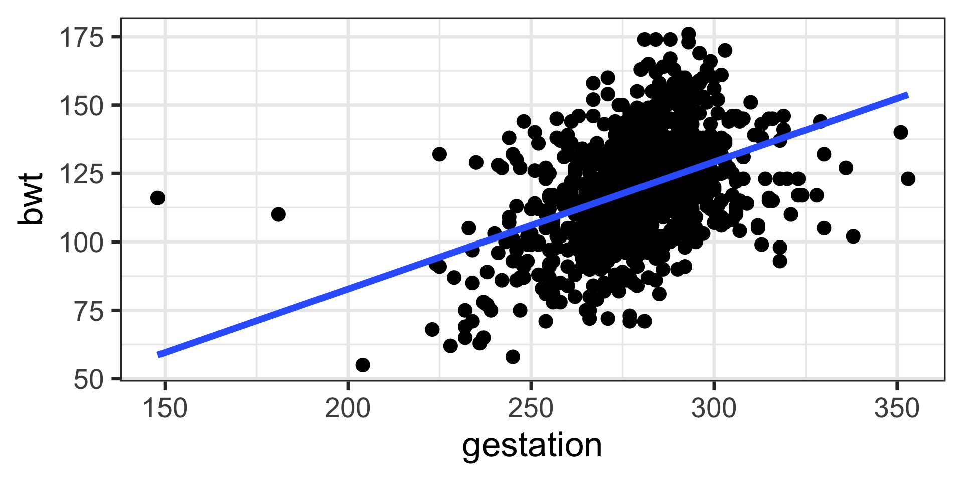
lm stands for linear model
se stands for standard error
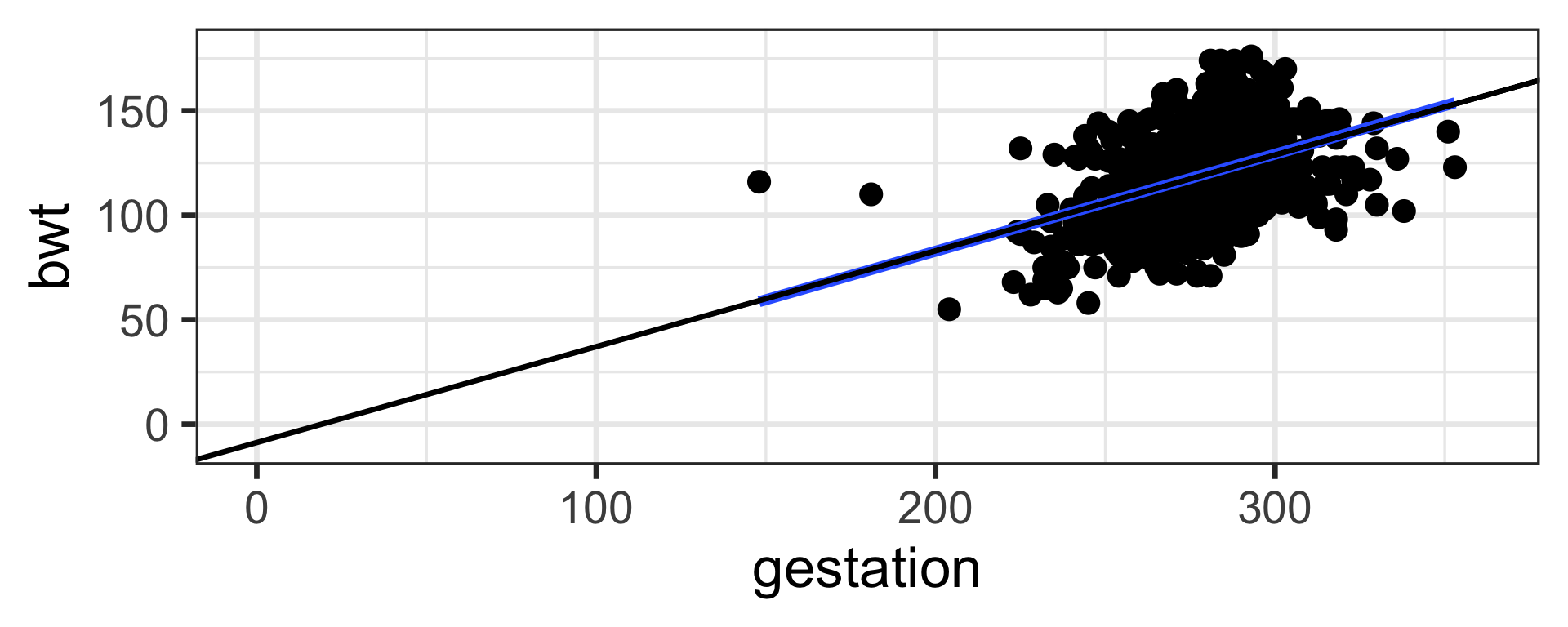
Linear Equations Review
Recall from your previous math classes \(y = mx + b\)
where \(m\) is the slope and \(b\) is the y-intercept
e.g. \(y = 2x -1\)
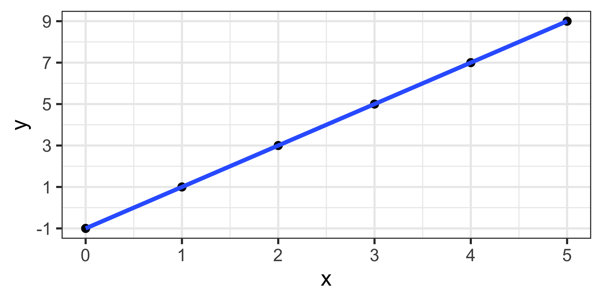
Notice anything different between baby weights plot and this one?
Interpretation of estimates
\(b_1 = 0.464\) which means for one unit(day) increase in gestation period the expected increase in birth weight is 0.464 ounces.
\(b_0 = -10.1\) which means for gestation period of 0 days the expected birth weight is -10.1 ounces!!!!!!!! (does NOT make sense)
Baby number 148
babies |>
  filter(case == 148) |>
  select(bwt, gestation)
# A tibble: 1 × 2
bwt gestation
<int> <int>
1 160 300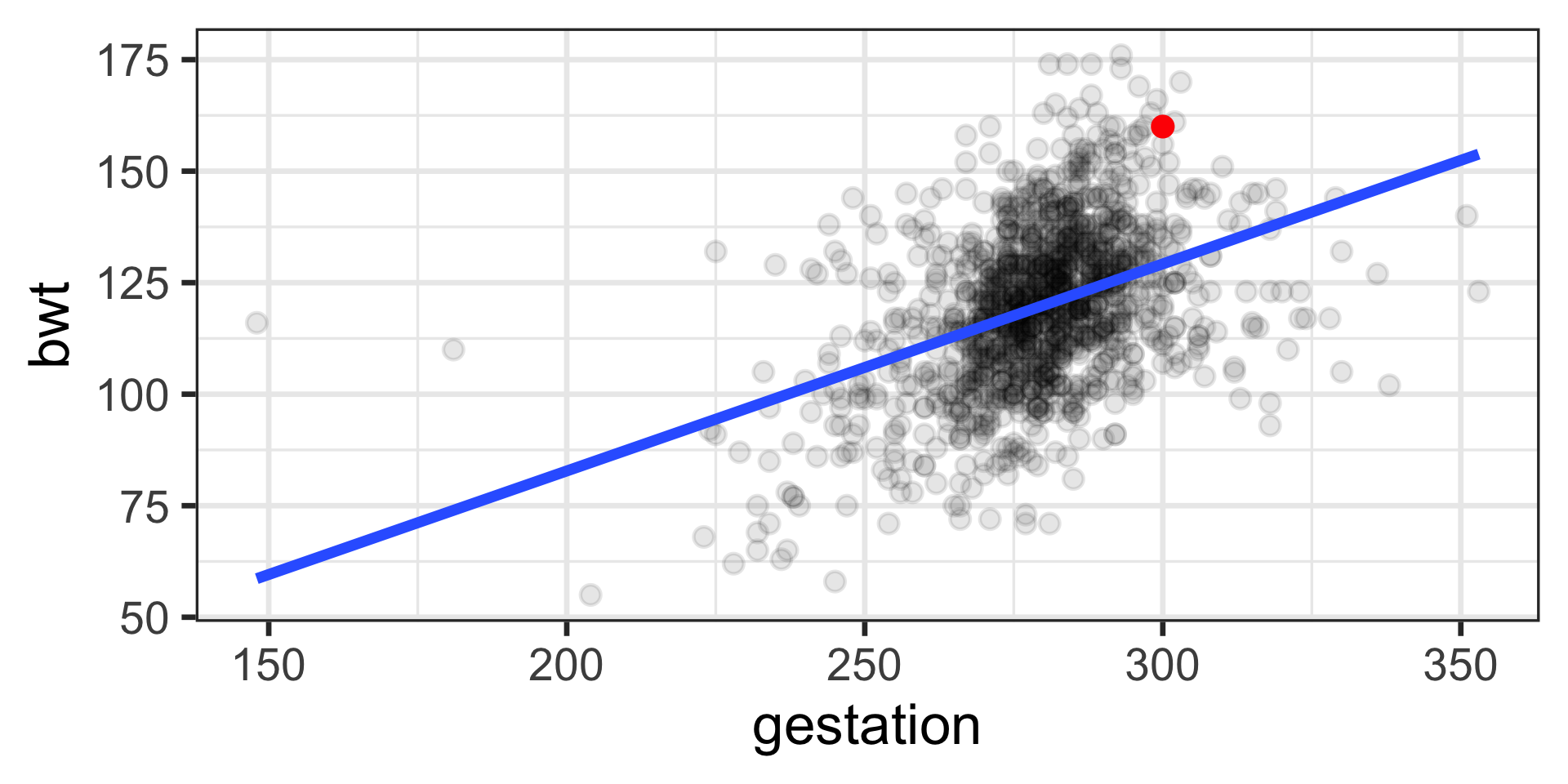
Residual for i = 148
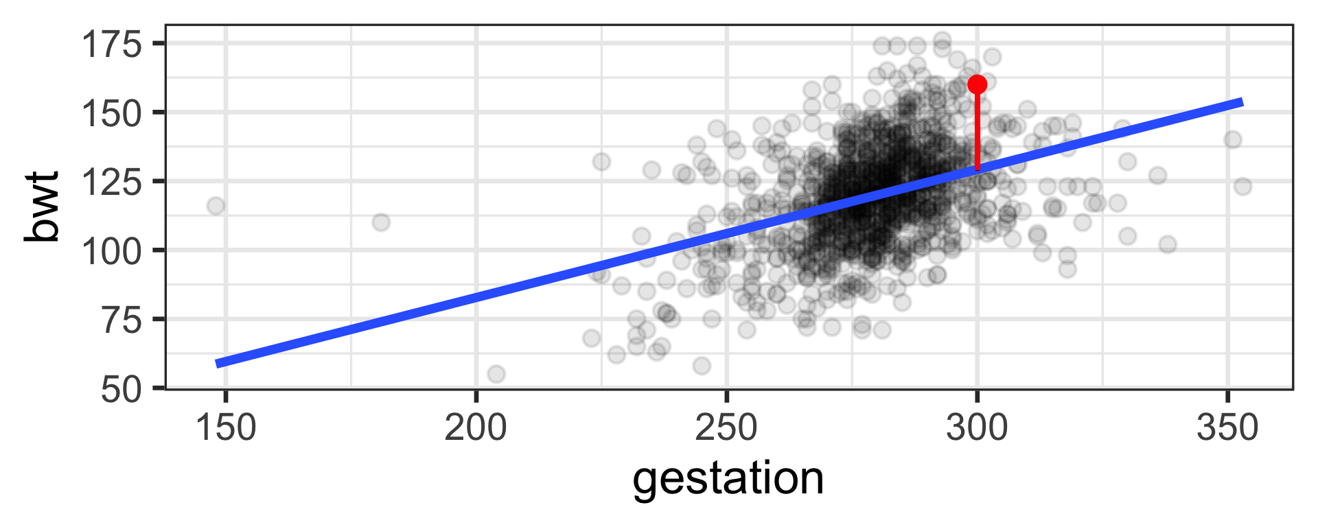
\(y_{148} = 160\)
\(\hat y_{148}\) = 129.1
\(e_{148} = y_{148} - \hat y_{148}\)
\(e_{148} =\) 30.9
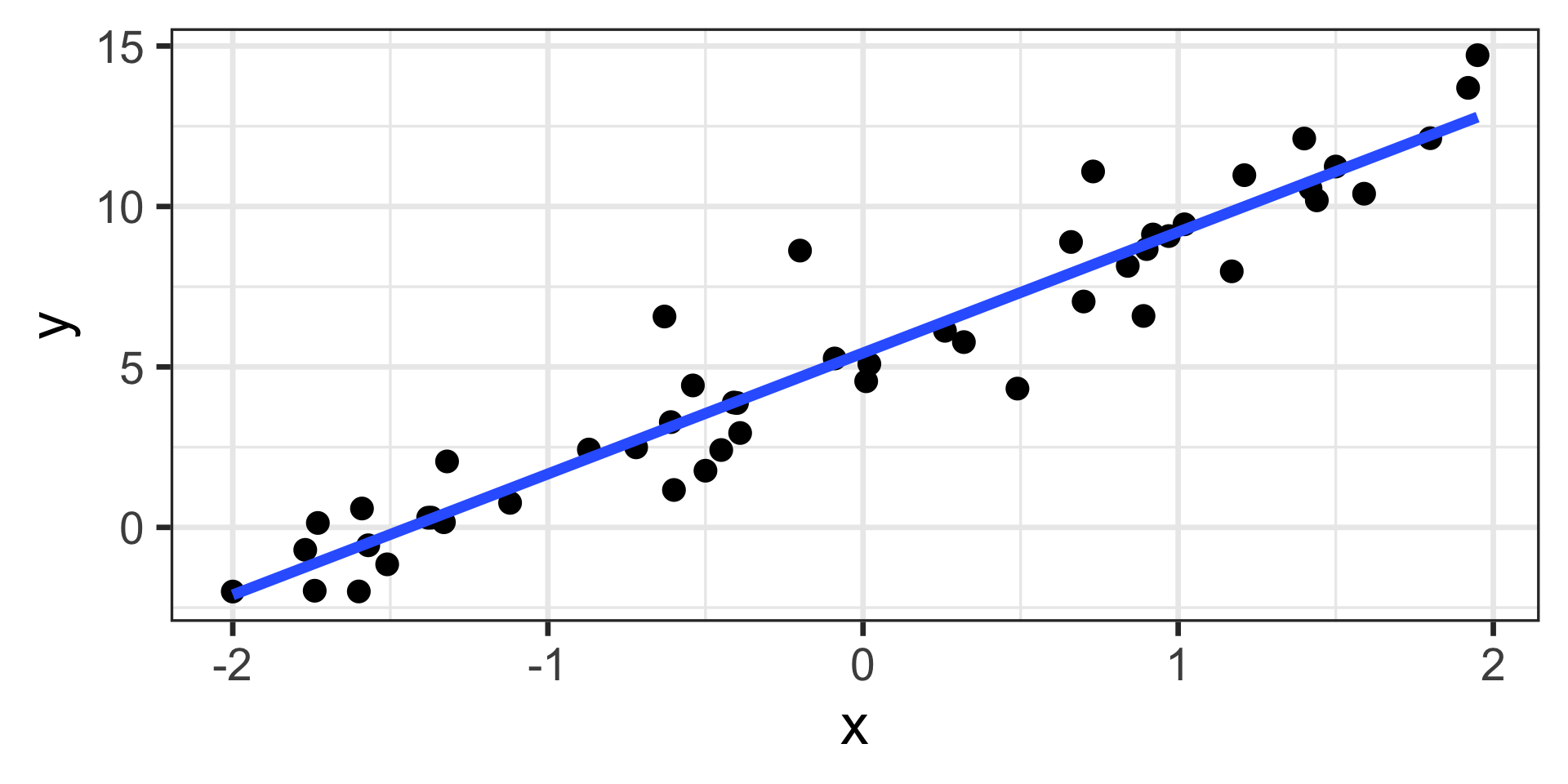
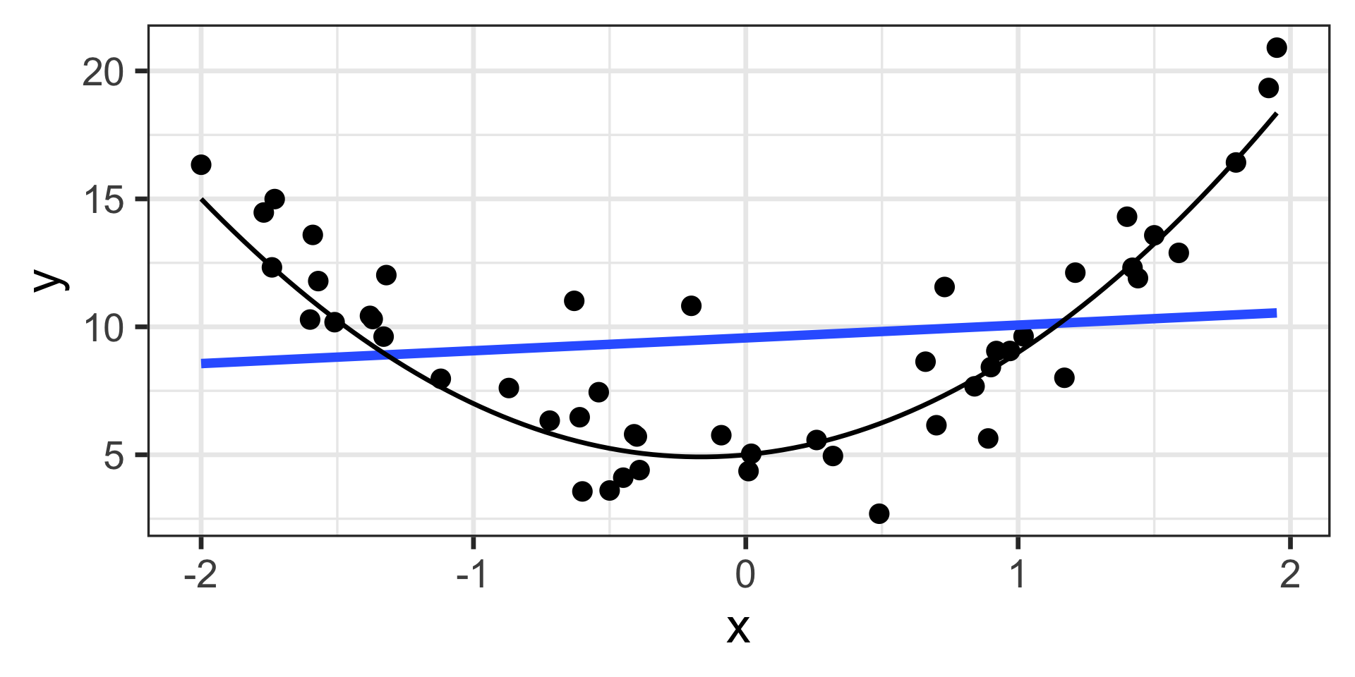
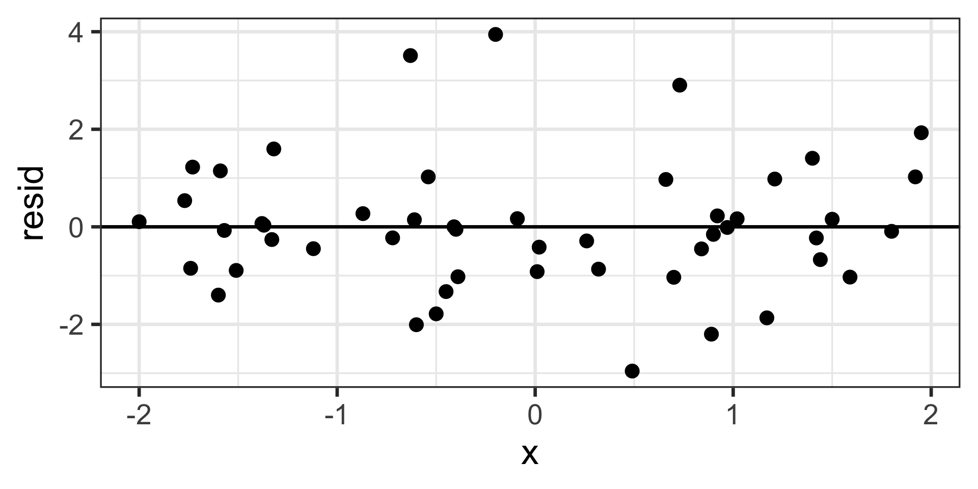
Linearity
Linear
Non-linear
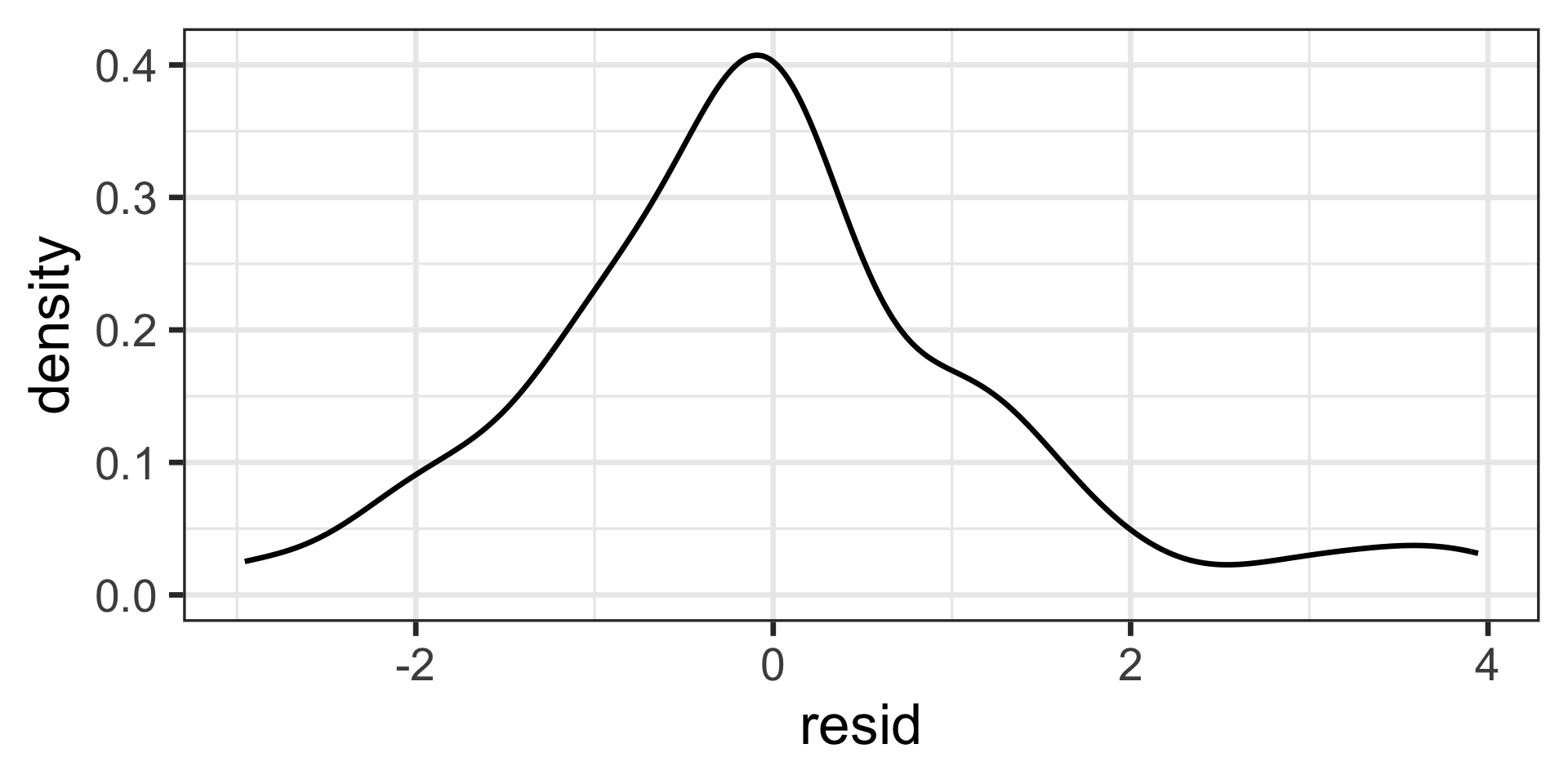
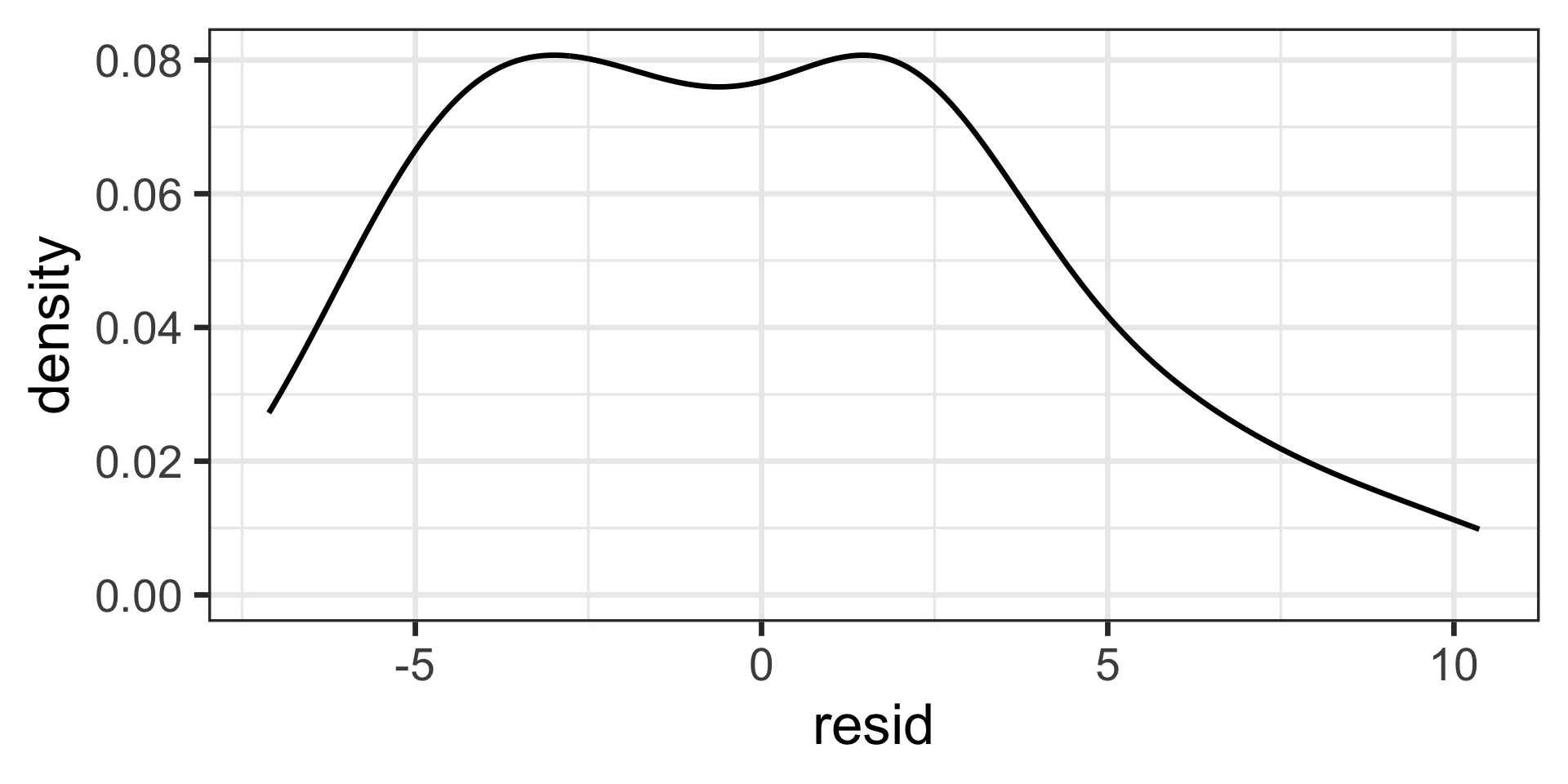
Normality
Nearly normal
Not normal
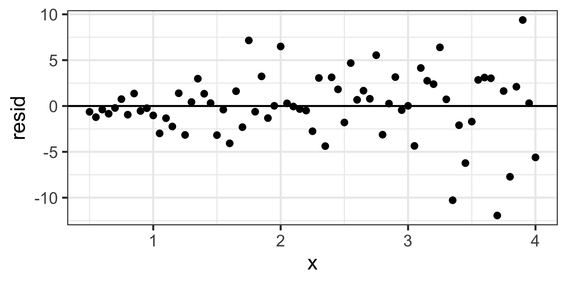
Equal Variance
Equal Variance
Not-equal variance